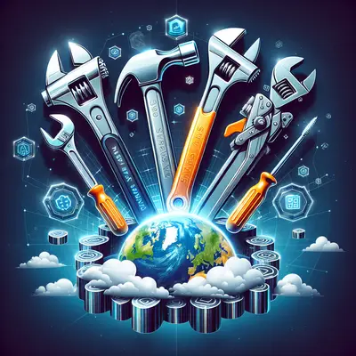
The internet is losing it over David Shrigley’s darkly funny illustrations and that viral “apps in the 1980s” art series by Luli Kibudi—because honestly, our feeds are starving for something that isn’t just another AI-rendered beige dashboard. While everyone’s sharing those retro app mockups, there’s a quiet SaaS truth hiding in plain sight: these throwback visuals actually expose what today’s tools are doing wrong… and what the best platforms are finally getting right.
So let’s ride that nostalgia wave and use it for something useful. If 2020s SaaS had to survive in an 80s-style world—chunky buttons, pixel fonts, no infinite scroll—what would still feel amazing to use? Below are five real trends in SaaS design and product experience that line up frighteningly well with the “less but better” vibe people are obsessing over on social media right now.
1. From Feature Bloat to “One Screen, One Job”
Those viral 1980s app artworks work because they’re simple: one chunky screen, one obvious action. No mystery meat navigation, no “maybe it’s in Settings → Advanced → Experimental”.
Modern SaaS is (finally) catching up. Tools like Notion, Linear, and Superhuman are pushing a ruthless focus on single-screen workflows where every pixel has a job. The trend: instead of dumping 40 features into one “Pro Dashboard,” we’re seeing:
- Dedicated views for a single outcome (ship a ticket, close a deal, send a campaign)
- Context-aware UI that hides everything you don’t need right now
- Clear, opinionated defaults instead of a bazillion toggles
SaaS review takeaway: When you’re evaluating a new tool, ignore the feature checklist on the pricing page. Ask: Can I explain what this screen does in one sentence? If not, you’re about to onboard chaos.
2. Bold, Weird Branding Is Back (Thanks, Internet)
Between David Shrigley’s deadpan doodles and Gwendoline Christie’s viral, gravity-defying hair at the Fashion Awards, the cultural mood is crystal clear: people are over safe, polished, corporate-speak aesthetics.
The best SaaS brands right now are leaning all the way into that energy:
- Linear’s neon gradients and sci-fi vibe
- Framer’s loud, motion-heavy marketing pages
- Figma plugins and communities full of quirky, almost meme-level visuals
Instead of blending into LinkedIn-blue oblivion, these tools feel like brands you discover, not corporate software imposed on you by IT.
SaaS review takeaway: When you trial a platform, pay attention to how it feels. Does it have a point of view, or does it look like it was generated by a “B2B SaaS Template” from 2016? Products with strong identity usually have strong product opinions too—and that’s good.
3. “Analog” Delight: Micro-Moments That Feel Human
That 80s-app art series hits so hard because it feels tactile—knobs, buttons, plastic, paper. In the same way, people are craving products that feel a little bit physical, a little bit human, even when fully digital.
You can see this “analog delight” creeping into SaaS UX:
- Subtle sound design in tools like ClickUp and Loom (but not enough to feel like a game)
- Playful microcopy that reads like a friend, not legal counsel (“You’re all caught up—go touch grass”)
- Confetti, badges, and tiny animations when you complete something meaningful
These touches are going viral in product teardowns because they tap into the same joy we get from those 80s-inspired app visuals: software that doesn’t take itself too seriously.
SaaS review takeaway: In demos and trials, look for those “tiny joy” moments. They sound superficial, but they’re usually a sign of a team that sweats details. Teams that sweat details on the surface usually sweat them in performance and reliability too.
4. No More “Surprise” UX: Predictable Flows Win
People love those “texts that take an unexpected turn” posts because they’re chaotic and shocking. That’s great for memes. It’s awful for SaaS.
The current wave of high-performing tools is built around brutal predictability:
- Keyboard shortcuts that mirror each other across features
- Consistent patterns for “create → edit → share”
- Undo everywhere, with clear states and history
We’re basically in the anti-“unexpected watermelon twist” era of product design. The best SaaS tools feel like muscle memory after a week, not a scavenger hunt.
SaaS review takeaway: During your trial, deliberately break things. Spam undo. Duplicate, delete, recover. If the product surprises you in a bad way—or worse, gives you that “did I just lose everything?” feeling—it’s not ready to be a core part of your stack.
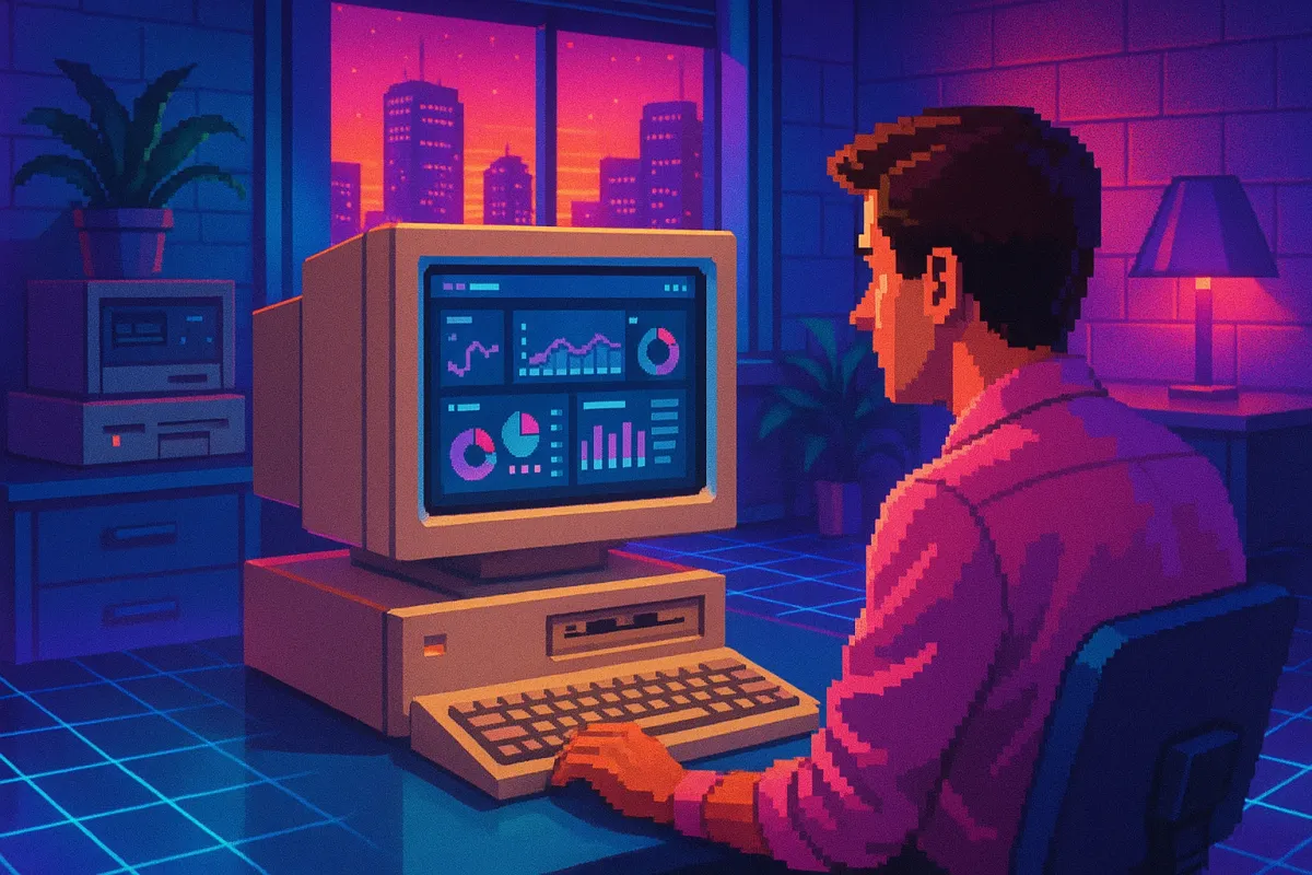
5. Retro Simplicity, Modern Power: The New Gold Standard
Those 80s app mockups are obviously not “real” software… but they point to a real craving: interfaces that look stupidly simple on the surface, while hiding serious power underneath.
The breakout SaaS players right now share that exact formula:
- Zapier / Make: simple “When this happens → do that” flows, insane integrations under the hood
- Notion / Coda: clean docs that quietly double as databases, apps, and workflows
- Retool / Softr / Bubble: almost toy-like editors that can secretly power entire internal platforms
Think of it as “retro on the outside, rocket engine on the inside.” The companies winning mindshare (and funding) aren’t trying to look complicated anymore—they’re trying to look stupidly obvious, then reveal depth only when you go looking for it.
SaaS review takeaway: Don’t be fooled by minimal UIs that look “too simple.” The real red flag in 2025 isn’t simplicity—it’s a product that looks complex but still can’t do what you need without three other tools duct-taped on.
Conclusion
The internet’s obsession with 1980s-style app art and dark, minimalist humor isn’t random—it’s a reaction. People are tired of bloated, joyless software that feels like it was designed by committee. The best SaaS tools right now are quietly responding by going back to basics: bold identity, simple screens, human moments, predictable flows, and power hidden beneath a deceptively chill surface.
If you’re picking your next platform, don’t just read the roadmap and pricing grid. Look at it the way you’d look at one of those viral retro app designs and ask:
“If this had to live forever on one chunky little screen, would it still make sense?”
If the answer’s yes, you might’ve found a keeper—one worth sharing, screenshotting, and actually bragging about in your next “tools I swear by” thread.
Key Takeaway
The most important thing to remember from this article is that this information can change how you think about SaaS Reviews.